Setu
Industry
Health Care
Our Role
Brand Identity, Packaging, Motion Design
A fresh, playful take on health and wellness
Setu is a supplement-nutrition brand that understands that health isn’t always easy and more often than not supplements, and the way they are communicated, can lack a bit of a personal touch.
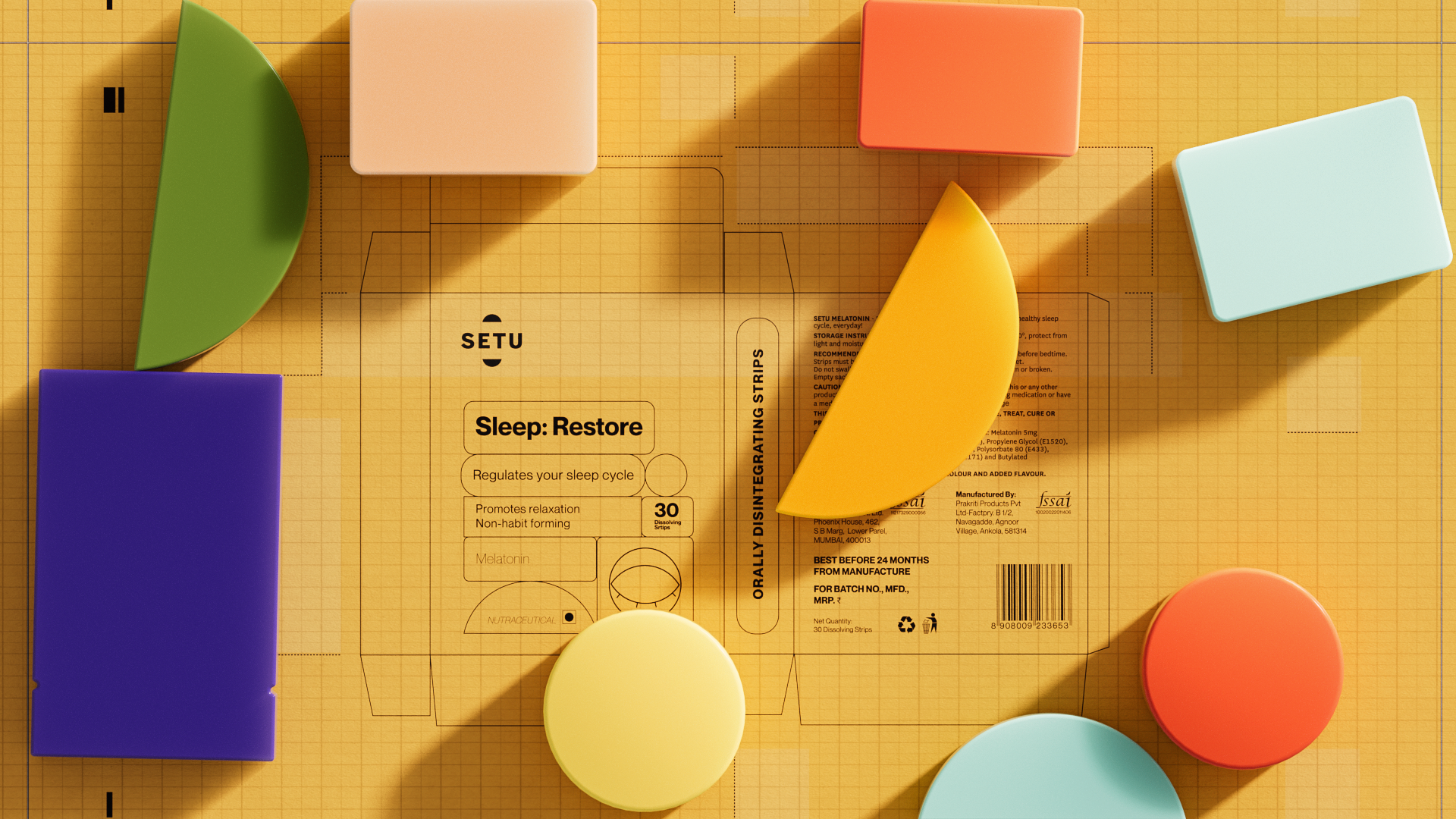
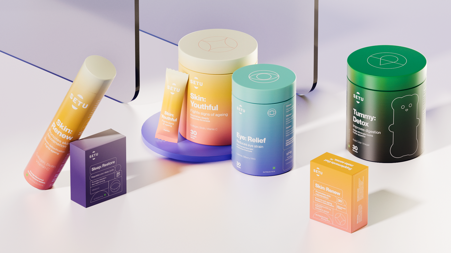
This is where our strategy for Setu’s brand identity takes flight. With a fresh and contemporary colour palette, Setu sheds the ‘medicinal’ baggage of the category. The packaging champions clarity and authenticity for visual imprint, which delivers brightness to Setu’s extraordinary benefits.
Setu’s packaging design is a brightness-filled re-imaging of medicinal supplements sans mundanity. Vivid colours, shape-play, and a smart arrangement of elements help bring to life clutter-breaking individuality to a category that can feel routinely clinical.
Bespoke icons are developed to give a distinctive identity to the products. Simple and accessible iconography along with defined gradients give insights into the category while making them customer-friendly.
The colour palette harnesses the power of the spectrum yet is shaped by the benefit or purpose of a given Setu supplement. Deep Sleep is a drowsy dark purple and Skin Renew a refreshing apricot.
This collection of the colours allows us to give a unique ‘visual shorthand’ to every product and creates a design-centred brand structure that makes Setu instantly identifiable.